Super modern home style look may seem hard to achieve if you are bound by the restrictions of your structure and do not want that the original structure should go through a knocking down process. It can be an expensive affair to break the walls and recreate the look, and you can also lose the original appearance of a Victorian home by reconstruction. However, there are ways to retain the Victorian architecture and still get the modern décor without having to knock down the walls.
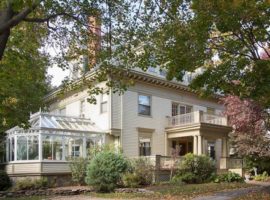
In this house, the homeowners loved their period home but felt the need to make their rooms more spacious and light-hearted to entertain friends and guests from time to time. The additional rooms rob them of the space, and they felt the space crunch while entertaining. The designer thought of creative design ideas and ways to make the best of the existing space by binding the design together with the natural flow of the architecture. She created a look with designs that appeared to have culminated over the years.
[Image: Lisa K Tharp – K. Tharp Design]
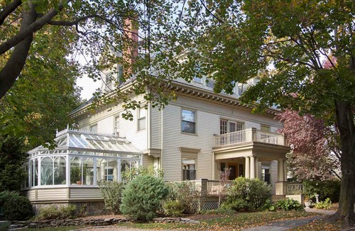
The home in question has been occupied by a couple of empty nesters with a 4000 square feet property sprawled over 372 square meters in Boston. The house consists of 6 bedrooms along with 4 bathrooms.
The homeowners of the property love to experiment and are fun people. They were not reluctant in using colour to make their house look cheerful and feel more welcoming for the guests. It has been challenging for the decorators to maintain the sanctity of a Victorian architecture and still achieve the look of a modern house.
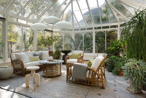
Image: Lisa K Tharp – K. Tharp Design
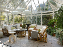
The designers took a tour of the house to locate a space that can be used for entertainment purposes. The couple had imported thick plant conservatory from England many years ago, which is being used as a greenhouse and could serve the purpose of an entertainment room after some treatment. With little persuasion, some of the plants were retained while some were given away to create a sunroom with ample greenery and radiant heat floors to keep it warm in winters.
Mid-century pendant lights have been used over the wicker furniture offering some amazing lighting ideas to the onlookers. Damaged cocktail table was repurposed to create a chalkboard tabletop to create a fun space for the kids. When hosting dinner parties, the dining table is moved to the area. It looks magical in the night when lit up, and the guests can enjoy piping hot meal under the stars.
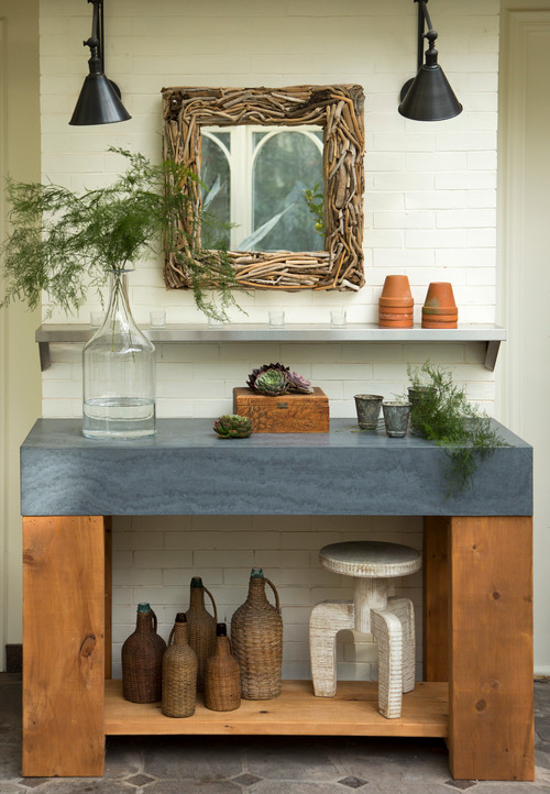
Image: Lisa K Tharp – K. Tharp Design
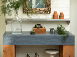
Even after doing away with plenty of greenery around the house, there are still some left that can be used to keep their love for plants alive. The entry to the entertainment room has been designed with a potting bench, which has been designed by using reclaimed wood and locally-sourced Fire-slate top. The table appears modern yet has been lit by using the traditional library lights along with wall-mounted shelf made of industrial stainless-steel. The diverse mirror on the bench completes the look by clubbing in different eras in the same corner.
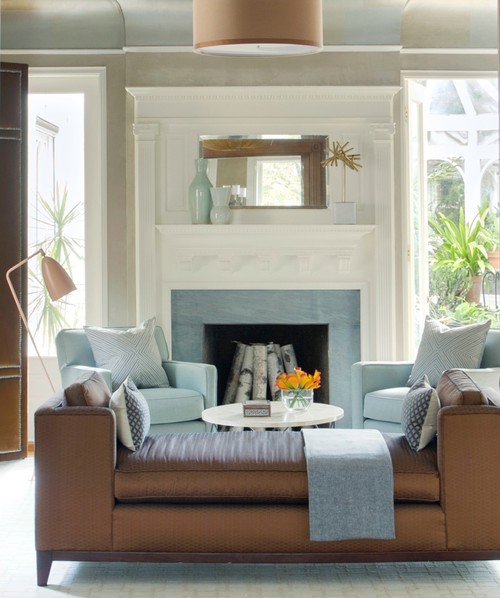
Image: Lisa K Tharp – K. Tharp Design
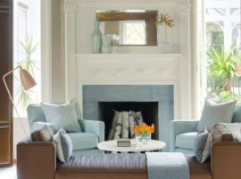
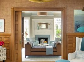
This room was initially a dining room, which has been swapped into a library to meet the lifestyle requirements of the couple. The house’s only active fireplace was in this area that became non-usable due to being blocked by the dining table. The couple needed a room where they could host cosy reading sessions with friends by the fire, which gave birth to this library. The dining table was moved to the end of the house, and this room was given two bookshelves that flank either side of the opening off the conservatory.
The seating was added to the room to make space for the party’s flow in the conservatory. However, this room also acts as an intimate space for the couple when they would like to read a book by the fire in peace. The furniture has been upholstered to match the accented three-panelled velvet room screen to the left. An eccentric lamp has been added to create more reading light and a modern look to the room.
The colour palette in the room has been taken from the fire and ice combination. The fireplace has been done with icy blue border, and the daybed has been covered in metallic hues to add warmth. A copper, bronze and gold leaf effect augments the warmth of the room when the light reflects off the fireplace.
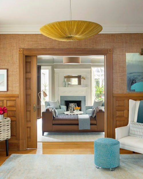
Image: Lisa K Tharp – K. Tharp Design
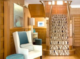
The library was faced by a large entryway, which had not been put to any use until now and was a wasted space. This place was recalibrated with the rest of the house by placing all the seating areas in the front of the house. This spot is placed between the library and the living room. The design of the entryway is such that it connects both the rooms with a common flow of décor. When the couple is entertaining large number of guests, the pocket doors can be opened, and it becomes one large space. Extra seating includes a stylish wing chair and a turquoise velvet stool in croc print along with a telephone bench that has been completed with a midcentury fabric. The placement of the bench makes sense as back in the day it would have been placed at the spot where it can be easily accessible from all the corners of the house.
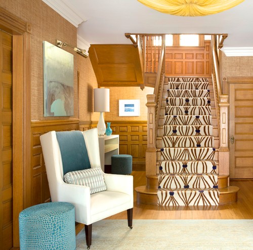
Image: Lisa K Tharp – K. Tharp Design
The console table along the chair can be used as a bar during parties.
The entryway has been designed in such a manner that it leaves a strong impression of the house décor. The runner on the stairs is catchy and takes the eye of the visitor upstairs. In addition to that, the oak mouldings and trimmings under the stairs as well as panelling under the windows tie the floors together into common design theme.
The silk fabric lighting attracts attention towards its size and is perfect addition to the Victorian Era décor. The grass cloth fabric on the walls falls perfectly in sync with the theme.
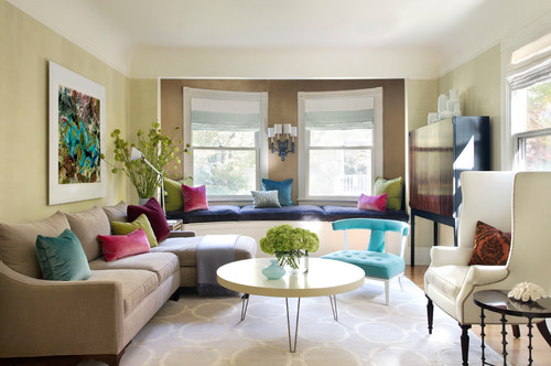
Image: Lisa K Tharp – K. Tharp Design
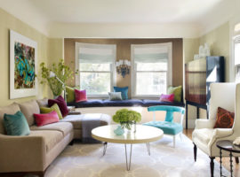
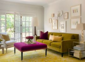
Across the living library and the foyer is living room. This room has been designed metallic hues and, pop colours suited to different eras. The mix of colours makes the room look modern yet cheerful. Contrast to a living room, the dining area has been done in natural earthy shades.
The colour palette of the room has been borrowed from the artwork above the sofa. The frame of the artwork is done up in white acrylic border with mounting it to aluminium.
The alcove wall situated across the living room has windows and coved ceiling, which adds dimension and character to the room. The room’s structure has been matched with circular patterned rug and turquoise chair in a circular shape. The cocktail table with hairpin legs brings in the old school décor theme to the room and the wall sconce in alcove complements and finishes the look.
The TV is placed in this room, which has been mounted on the wall on the right and covered with an ultra modern narrow cabinet that does not crowd the room.
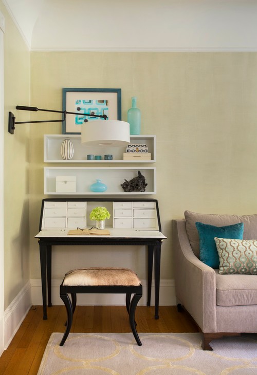
Image: Lisa K Tharp – K. Tharp Design
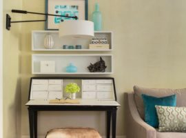
This room has been designed in a multi-functional way with a vintage desk that can be used for storage and writing notes. The midcentury painting plays up the Victorian era mixed with modern touch.
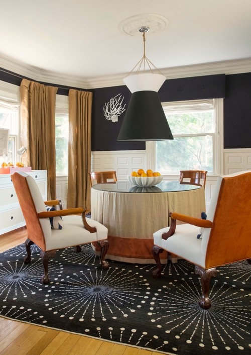
Image: Lisa K Tharp – K. Tharp Design
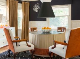
The former TV room has been changed into the dining room and has been placed across the kitchen. Just like the rest of the house, the styles have been mixed with different fabrics while retaining the original panelling. The room has a neutral palette that lends sharp contrast to monochromatic theme.
The walls are upholstered in the fabric chosen by the homeowners with X-shaped seams tufted into the panelling. The white trims provide contrast to the dark colours on the walls. The other fabrics and colours around the room put together roughness and luxury. The chairs have been reupholstered using leather and suede. The table linen has been covered in silk with a glass top. The windows are covered with golden draped with a circular patterned rug, which adds to the midcentury theme.
Pendant lights above the table have been customized, and the two lampshades have been clubbed to get a large one.
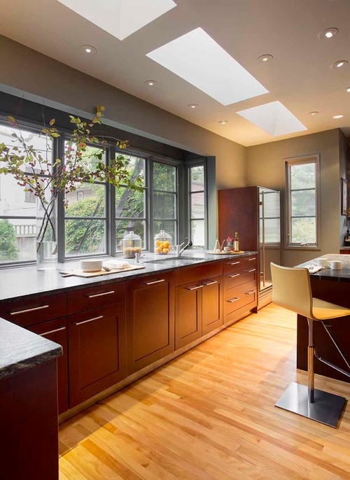
Image: Lisa K Tharp – K. Tharp Design
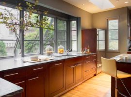
To maintain the comfort levels while cooking, the kitchen did not go through a massive renovation. A bay window over-the-counter top made of soapstone provides a complete view of the backyard and the skylights on the ceiling are a good source of natural light during the day. The décor has been kept simple to match the Victorian yet modern theme.
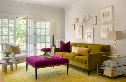
Image: Lisa K Tharp – K. Tharp Design
Adjacent to the staircase landing upstairs, a living room has been positioned with doors opening into the balcony. The room has been done up in metallic hues of the living room making it look more casual and inviting. Although, it has been connected with the rich décor on the top floor, it still maintains its light heartedness through its pop colours.
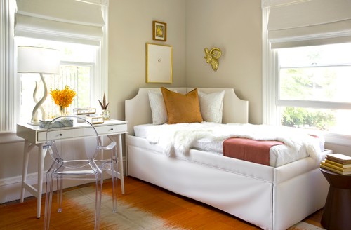
Image: Lisa K Tharp – K. Tharp Design
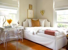
The guest bedroom design is done in semi -casual way so that it appears fun and non-serious. The tribal print rug with a vintage desk and clock matching the ghost chair are perfectly complementing each other’s look and personality.
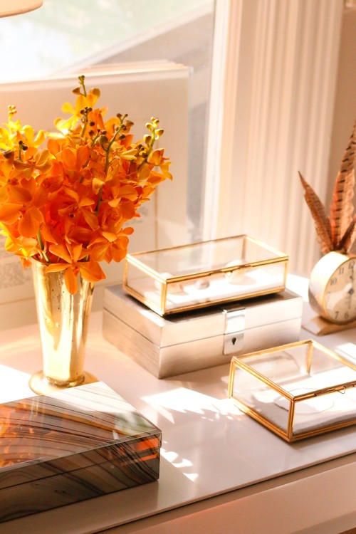
Image: Lisa K Tharp – K. Tharp Design
The glinting glass boxes have been used as show boxes for displaying travel items from across the world. The guest room has been completed with giving it an over-the-time look.
Victorian era has been that of ostentatious display, and the modern era is all about sublime and subtle décor. This house has used the best of both the worlds in creating a perfect amalgamation of the two concepts to make the house look more inviting and less daunting by underplaying grandeur of the Victorian architecture.


