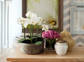
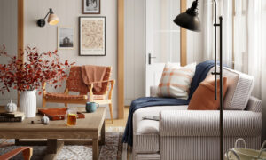
If you have been hoarding on to your loving masterpieces for all these years and now would like to them out for a show-off, now is the time. However, the only problem in the larger scheme of things is that you are not really sure how to do all of that and more. Another frustrating thing to see is that the designers and professionals, somehow always get it right. You can also get that polished look that they fancily call vignette.
Play with the heights
[Image: The Eclectic Creative Studio]
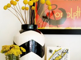
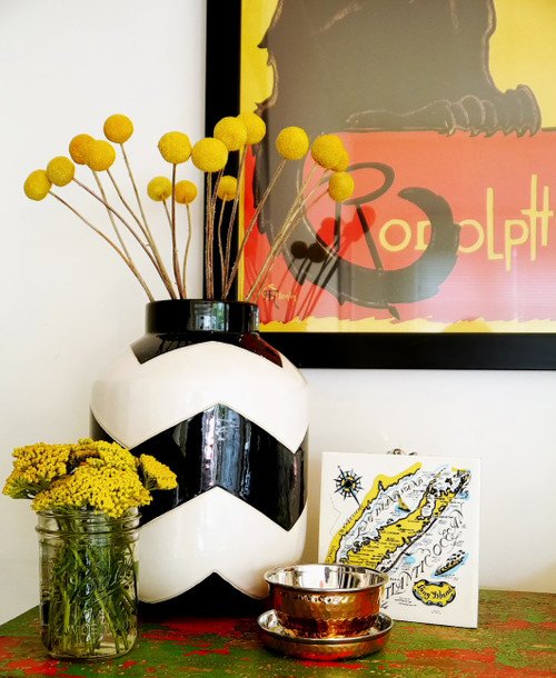
When you want your vignette to look stylish and something with a touch of an expert, then make it look unique yet effortless. You can get this look easily by altering the heights of the objects you are using in your arrangement. In your mind, imagine that you are arranging the things as per a triangle. The tallest one will act as a peak while the shortest one will form the base of the triangle. The vignette should be of visual interest so anything too common will go unnoticed. You can get good height by introducing items such as table lamps, mirrors, picture frames, etc.
Be a storyteller
[Image: The Eclectic Creative Studio]
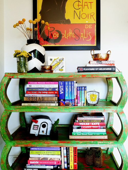
The most important thing to know about rearranging bookshelves or bookcases is that they should always be able to tell who you are and only contain the things that you love. Your shelves should tell a story, your story.
If you always stick to things that you have a person affliction for, then soon you will start to see a theme emerge. You may be eclectic, but there always will be a personal style that binds the whole thing together. This theme is what makes your arrangement appear well thought out and something where a lot of heart has gone into, when it virtually took no effort at all! You can start with teaming things related to travel and vintage if that is your speed.
Experiment with the textures
[Image: The Eclectic Creative Studio]
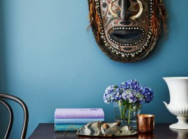
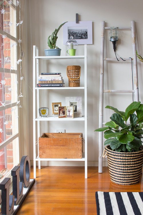
Mixing textures works beautifully even in spaces like shelves. When you use the same pattern all across the shelf, the final look is boring and dull. Your vignette should work as a focal point which requires you to carefully select the arrangement. Mix shiny look with something plush combined with raw and rustic finish. Together they will make an interesting looking display.
Don’t stuff every nook
[Image: Bower Architecture]
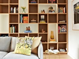
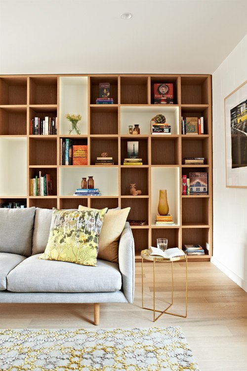
Empty space does not mean it has to have something in it. You can leave some nooks alone which gives the eyes a rest and allows it to focus on other important things in the area and the things that you want to flaunt. It also makes your arrangements look more spaced out than cluttered. Vignettes should focus on placing the objects thoughtfully.
Think out of the Books
[Image: The Eclectic Creative Studio]
To put books in bookcases is so passé. Your shelves can be used for a much exciting display. This spot is the best place to showcase all your personal something like keepsakes, curios, etc.
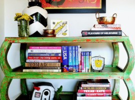
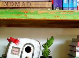
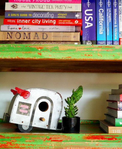
Your vignette needs to tell a story, your story. You can creatively group all the books with similar genres and place related items along with the cluster. For instance, in this image, the cookbooks and travel books have been placed right next to the trailer and a small cactus. This small charade stays true to the theme and tells a story with its effectual display.
Be open to Mixing Styles
[Image: Interior Design Excellence Awards]
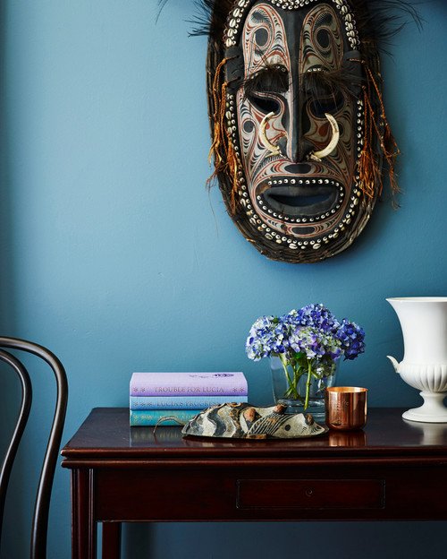
Your home is your personal space and it is allowed to break a rule or two. By mixing styles and patterns, you are introducing visual interest to your vignette so don’t be afraid to try. Take out all the little things that you have been hoarding from all your travels. Bring it out and give it a mantelpiece it deserves.
You can frequently switch items from one room to another. This will bring in the fresh look every now and then and will also be more pocket-friendly as you are using the same items. Use your display judiciously. No need to take it everything all at once. Utilize it one at a time and alter them seasonally.
Don’t Fixate over Even Numbers
[Image: The Eclectic Creative Studio]
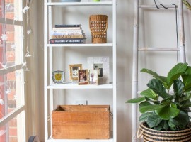
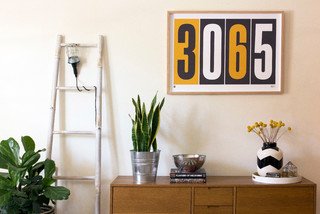
Odd number placements have a unique ability of attracting the eye to its arrangement. It is a general habit of a human eye to wander to subjects at the center of the formation. This is why an odd number helps in creating a pleasing composition and a balance. You can try formations of three, five, and seven or more so far as you keep it odd numbered it will always appear a tad more interesting.
Use Repetition Creatively
[Image: Cary Bernstein Architect]
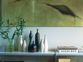
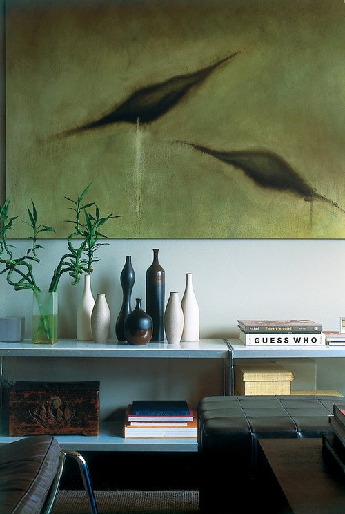
If you have same lot of things, don’t worry because they can be grouped together to get an eclectic impact. One of the finest living room decoration ideas is to put all your objects together in the creative arrangement and don’t forget the potent other tricks while you are doing that. Mix the textures, play with the heights, group the same colors, etc. Together they will make a much greater impact as compared to being placed singularly on one of the lone shelves or cabinets.
Use Vertical Space
[Image: As you See It!]
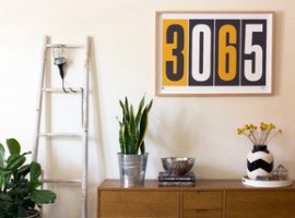
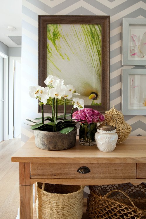
When you are styling a shelf or a bookcase, don’t forget to use the wall directly behind it. This will help you in using the height more appropriately. You can fix mirrors or artworks to create a matching grouping of objects. You can hang them or lean them against the wall. But the trick here is to have much greater height as compared to the objects.
When you start using these interior décor ideas and tricks around the house, you will soon discover that you have your own personal reflection which shows in all your arrangements. It is your home so feel free to dress it up the way you like!


