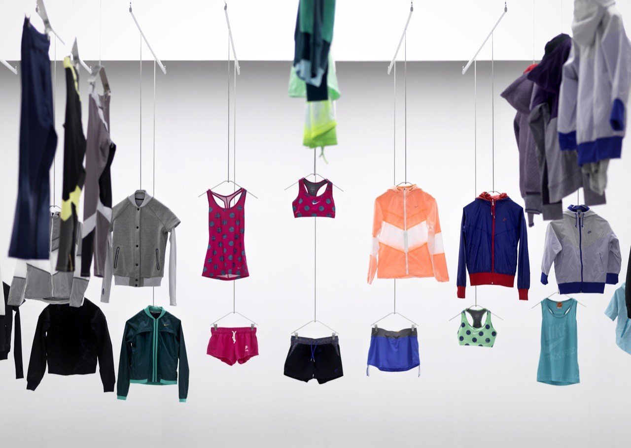
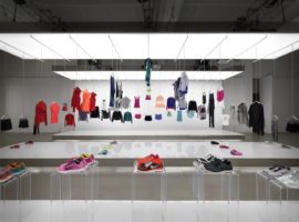
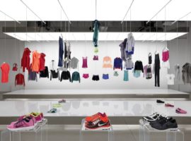
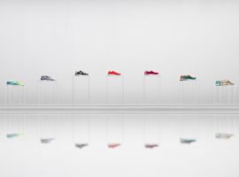
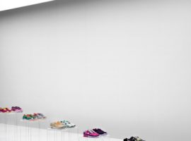
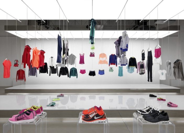
The Nike Pop up Showroom designed by Maggie Peng & Albert Tien, in China, is a branded Nike retail outlet exclusive for women clothing and footwear. A more explorative and futuristic theme is employed for the showroom, which highlights the brand logo, the display of clothing and the choice of colour palette with materials. In a more redeeming manner, the architect has decided to focus on the display collection by suspension racks where clothes hang in the mid-air by cables, which create an illusion amidst the bright starky lights thus offering some futuristic design ideas to the visitors.
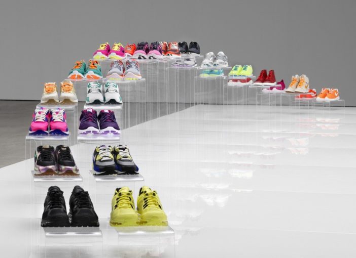
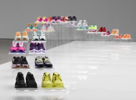
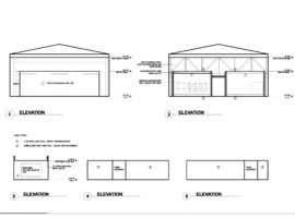
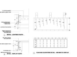
To focus and throw better attention, they used 3 individual set of plinth platforms where one is suspended from the ceiling, and the other rests on the floor. It creates a desired visual depth and gallery space for the display of clothes and footwear in a more innovative style. Behind the display, there is a projection screen, which highlights the various other products available in the store. On the interior, it is a rectilinear layout, where more than one-third of the space is designed to house the display gallery while the entrance lobby and the conference room occupy the remaining space.
In this retail store, ample importance is also given towards the logo display, which talks about the brand and the driving force behind the entire product range. At the entrance lobby, there are blue neon illuminated walls on either side from the ceiling and floor base, with the logo etched on the mid-wall. From the entrance, opening on either side of the wall leads to the gallery and the conference room. On the whole, clean, chic and white interior with ample space to walk around and explore, the store is functional, minimalist and very trendy in keeping up with the name of the brand.
Photos By : Jonathan Leijonhufvud


