Bedroom Decorating Ideas
Classic French Furniture for Cosy Conversations
With the help of this classic French furniture, you would be able to solve the basic question about the furniture placement while promoting intimate conversations.

Tete-a-tete is a perfect party seating arrangement for the upcoming holiday and has a very good reason to be called one. It is quite normal to be seated in a crowded room full of people without being able to hold conversations properly with your close ones. It is, especially, a task when you have to wrench your neck ever so often just to be able to hear what the other person is saying. It is also difficult to maintain eye contact in this position, which defeats the purpose of an intimate conversation. Just throw in some snacks while trying to get the perfect seating position and this whole thing will turn into a mess. This is when tete-a-tete comes into play, which makes your seating comfortable without forsaking comfort.

[Image: Martha O’Hara Interiors]
In French, tete-a-tete means head to head and the seating arrangement follows this translation of the phrase to the rote. This S-shaped seat is created in a serpentine outline that encourages two people to have a face to face conversation. This is not only a comfortable option for the two people but also visually fits well into the décor.
This piece of furniture was created in the 19th century and is known by many other names, which also include ‘the gossip’s chair’. It was created back then to not only aide close conversations but also helped courting couples to look each other straight in the eye, without any physical touch.
The traditional tete-a-tete comprises of two single seats that include a barrier in between them as shown in this image. However, since then there have been many other configurations that imitate this concept without actually including the divisive frame. This can be seen in tete-a-tete lounger, which is a rendition of a chaise lounge minus the barrier with two facing yet opposing heads.
Advantages of using this type of seating
Creates a bridge between furniture

[Image: BarlisWedlick Architects, Tribeca Studio]
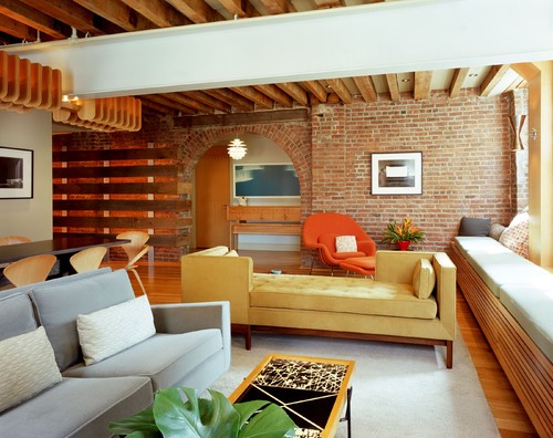
A tete-a-tete has a dual orientation that creates an aesthetic divide between two seating groups in the room. It can bind the room together by including the piece of furniture but still maintain a level of privacy when needed. The seating zones appear as one large arrangement of two distinct groups without actually dividing the two.
In this image, tete-a-tete bridges the gap between two seating groups that has been included in a large living room. However, if there was a traditional sofa that was placed instead of tete-a-tete, then it would have created a huge divide by creating distinctive halves and the seating area placed on the other end of the room would become alienated from the rest of the room.
[Image: Laura U, Inc.]
If you want, you can include an elegant looking tete-a-tete that works perfectly well in a formal living room area instead of a standard sofa, which easily binds a large living space into one big room.
In this image, the owner wanted to create a second seating space to involve more people in a conversation and open up the great room to include more people. This seating has been placed adjacent to the kitchen for easy movement of snacks during the evening.
[Image: Laura Britt Design]
If you have an amazing open view then to include a seating with double orientation can be beneficial for both the parties by involving them in intimate conversations while enjoying the beauty.
The Furniture can Act as a Conversation Piece
[Image: Jennifer Stoner Interiors]
The three piece tete-a-tete set is perfect as a conversation piece in both literal and figurative terms. The room where the seat has been placed is a prominent section of the house and the designer wanted to use a piece that can make a statement. This piece of furniture has become highly popular with the guests because of the ease of conversation and offers some great interior design ideas to onlookers. You can also upholster and refurbish an antique piece to make an even richer concept.
Disadvantages of using a Tete-a-tete
It is very Space Consuming
[Image: Jeremy Harnish Designer Finishes]
Tete-a-tete is available in many sizes and can vary from a small love seat to a full blown sofa. They may appear normal in their size, but they require a lot more space on both the sides to easily accommodate the piece. Many spaces may face the crunch and may not be able to accommodate its large frame.
In an ideal situation, it is advised to leave at least 3 feet of clear space on the floor, which includes both the sides of the package. However, bare minimum that is needed for easy movement is nothing less than 1 ½ feet. For the sake of understanding, a 3 foot deep tete-a-tete would easily need at least space between 6 and 9 feet deep to accommodate the couch. The one that has been placed in this bedroom image has a lot of space on both the sides.
Requires additional space for door clearance
[Image: Hamilton-Gray Design, Inc. ]
The best thing about using sectional sofas is that they can be easily fit inside the door because they have to be integrated later. They generally come in pieces, which can easily be transported into a room. However, it can be very challenging to manoeuvre a tete-a-tete with its large frame and arms and legs, which are sticking out from both the sides.
It is better to check with the manufacturer beforehand regarding the minimum clearance requirements before you make a purchase. It is always better to first take stock of the room measurements and then buy the sofa.
This is not enough. You also need to make sure that you are aware of the size of the passageway that leads all the way to the destination of tete-a-tete. If it includes a narrow stairwell or hallway, then you may have a problem. You need to check with the furniture movers before buying that piece if they would be able to carry it to the room.
Design Limitations
[Image: toro-lombardo design]
The upholstery designs best suited to a tete-a-tete comes in small scaled patterns so any elaborate prints that you would like to add on your couch will not be a great idea. The manufacturers even go so far to say that you must especially avoid stripes. It has also been suggested that you need to avoid repeat patterns as it would make it look chopped. Instead, one should choose tighter patterns so that they are not repetitive.
Styles to choose from
[Image: Ikaria Living]
These pieces may have come from the 19th century, but over the years, they have become so versatile that you can get them in all kind of styles and designs to suit even the most modern homes.
Midcentury Modern Design
Tete-a-tete has made a huge comeback in the midcentury modern décor that is so commonly seen today. Especially the ones with its blocky patterns and planar form work perfectly with a modern midcentury home as one can see in this highly styled living room.
[Image: Melinamade Interiors]
In this home, the designer has mixed the vintage midcentury modern furniture very aesthetically with a customized tete-a-tete as it can be seen here. This room is long and narrow in appearance and a tete-a-tete very cleverly combines fireplace seating with an adjacent TV wall.
Contemporary Look
[Image: CANTONI]
In this image, one can see the fluidity of the design of this tete-a-tete, which is a statement and a dynamic piece of art in itself. It can easily dress up any room on its own.
[Image: Mars Photo and Design]
This arrangement is technically known by the name of dos-a-dos. It is a contemporary addition to the family of tete-a-tete in which it does offer varied seating orientations. However, instead of facing each other, the people sitting on this one will have their backs to one another.
In this room, the golden yellow hue of the centrally located dos-a-dos provides an eclectic punch to the room and also makes a strong statement.
Traditional Seating
[Image: Martha O’Hara Interiors]
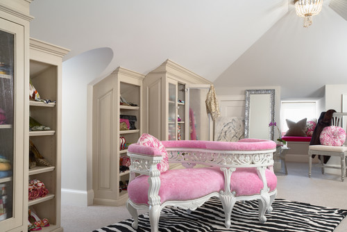
In this example, the tete-a-tete that can be seen in the image is that of a traditional seating design, which has a separating frame dividing the seating areas in two.
The wooden frames of the seat have been carved and painted in white that matches the bubblegum pink fabric complementing the traditional nail heads. This piece has been fittingly added into a closet.
Finishing Touch
[Image: Jonathan Adler]
The shape of the tete-a-tete in this image is very impressive. However, it is the finishing touch that adds more appeal to the whole look of the seat. The self design on the couch is very aesthetic which artistically lines the top, sides and the bottom while strengthening the linear look of the shape of the seat.
[Image: Towne Architects]
In this image, the traditional nail heads that have been evenly spaced on this tete-a-tete complete the dark contemporary look.
Tete-a-tete has come a long way from just being a functional seating arrangement to the one that can be used in any kind of room with any kind of design. It has a much greater functionality and aesthetic value with so many designs and styles available. Choose the one that can fit your style requirements adequately and also meet the purpose suitably.