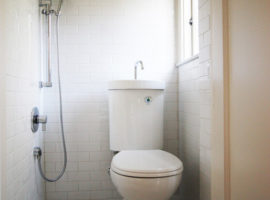
The bathroom is a pretty ignored area in many homes till date. But the increasing awareness and exposure to the latest design ideas and concepts, as well as a huge craze about expensive bathroom fittings has created the need of a plush grooming space. How about a rundown of the common pitfalls of design that can be made while renovating? When renovating or getting a new one made from scratch, these mistakes can be avoided to improve the utility and functionality of your vanity area. Take a look:
- Having a clear view in:
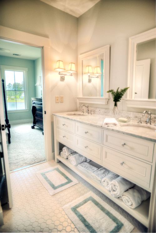
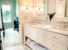
[Image – Shoreline Construction and Development]
The bathing and dressing area is your private space. Having an unobstructed view-in means that privacy is compromised. Even worse is if the adjoining room is an eating space or living space – these things have a boundary of their own, and need to be respected. You need a type of formal stoppage for the line of sight, to break the view from the sitting area to the toilet, like a hallway, partitions, curtains and other minor changes, like a half wall or tall chest in between the two.
- Having no view out:
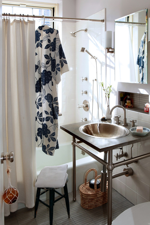
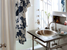
[Image – moment design + productions, llc]
Is your bathroom just a tiny and dingy place, which needs constant electricity and artificial ventilation? The place sure does not sound very attractive – you need to have a window for hygiene and design reasons, both. No windows possible? Have a skylight to let the glorious natural light filter in, making the place happier. Fresh air is also responsible for making the bathroom more appealing.
- Having the toilet as the focus of the room:
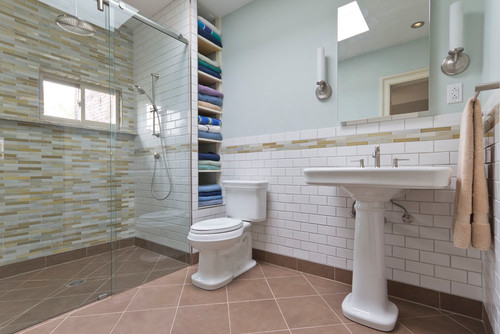
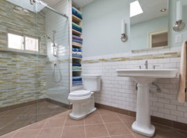
[Image – Green Mountain Construction & Design]
The space is not just about the toilet! You don’t want to centre everything on the toilet, compromising the sink positioning, or showering area or closet either. Have the toilet placed well away from the door, line of sight from other rooms and it its own compartment. Having a separate compartment for the bathing area and sink is a good idea, as the space can be used by two people at once easily. The separations can be of glass and strategic storage placement can assist in creating a virtual division in the room.
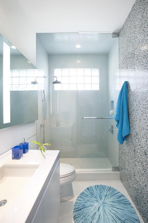
- Having the notion that “Bigger is better”:
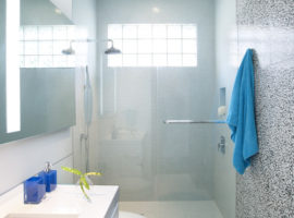
[Image – DKOR Interiors Inc.- Interior Designers Miami, FL]
Well, no. Bigger is not necessarily better, but a good and planned design is better. Don’t let this notion bring you down when you find your own bathroom small! Just lay it well and you are good. It should work well. All aspects should be in harmony and cost less while it is easier to maintain.
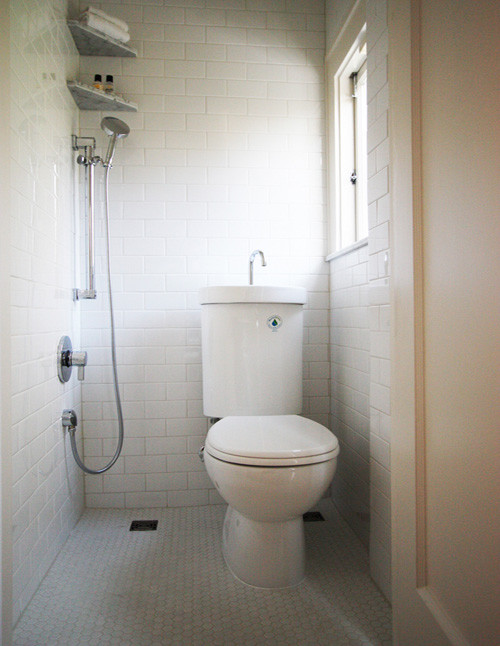
- Having a craze for curbed – shower:
[Image – Hammer & Hand]
It is no rule that only a curbed shower or shower in a cubicle is good enough. It is not a practical solution in many a situations. Especially for old people and kids, a curbed shower means more chances of an accident and more problems maintaining it. Go for a simple, open space if your bathroom is too small or there are elderly around. Just make sure the design principles are not violated in there.
Having the ideal bathroom means a lot of time and efforts saved on the maintenance, a good and positive feel and enhanced functionality. What else do you need for a bathroom? Go for a smartly planned one and enjoy getting dressed each day! Consult a good designer for some great design ideas before you go ahead with any permanent makeover as they understand the technicality and study the available options well before doing anything solid. But do have a vision of your own to express to the designer. Good luck with the renovation!


